Mantic’s GCPS Troopers had been my white whale for a long time. When I had the harebrained idea to make a loyalist version of Renegade and Heretics some 11 years ago, I spent years looking at cheap Imperial Guard proxies. Mantic was supposed to be the chosen once, and GCPS troopers its spearhead. But I never liked the look of them on the store. So I finally Mantic nicely for some minis and they sent me a GCPS Troopers sprue to review.
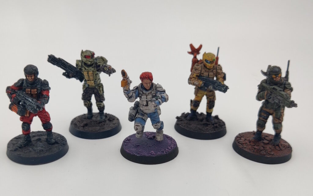
GCPS Troopers sprue builds five; it can also be used to make the GCPS Rangers – that’s the two bubbleheads on sides. So you have a few heads to choose from for either unit. You also have the ever-so-slightly different weapon options, Ranger jump-packs, radio packs and pistols. There are even special weapons.
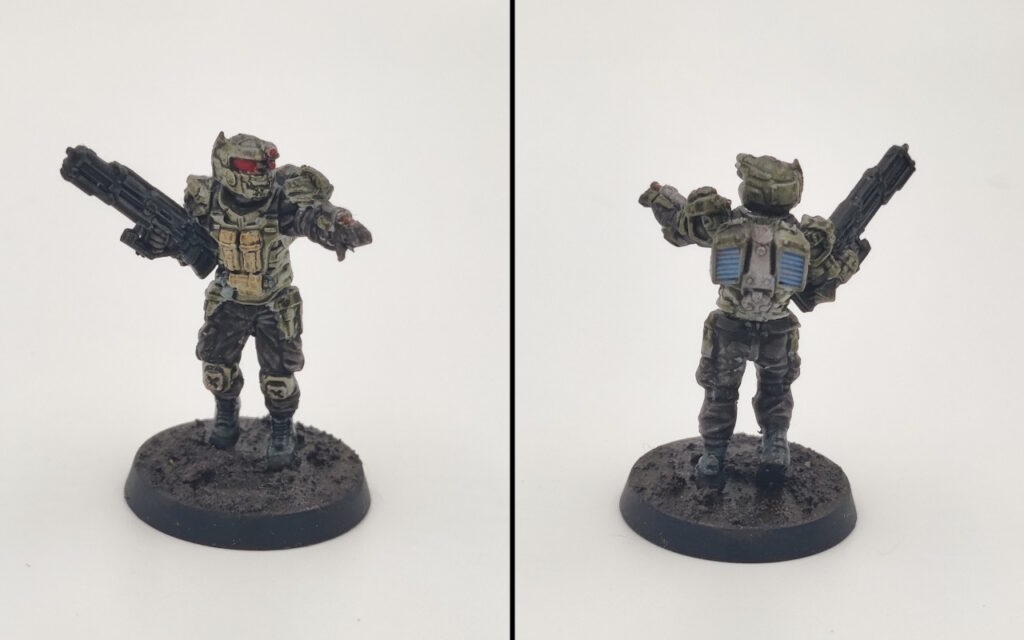
There is some random kit on the sprue – think holsters – that you can add , especially to the thigh holster. You can see the science lady has some Space Marine scout binoculars there. However, nothing really stands out, and the duders/dudettes will look fully kitted-out even without the accoutrements. Compare this to Guardsmen or Space Marines who would have bare waists if you didn’t add grenades and canteens.
I don’t know if it’s still a thing we should talk about in 2024, but the GCPS Troopers sprue didn’t require too much cleaning. Which is great, since removing mold lines on kits this detailed has always been a pain. However, I ran into two issues:
- The contact surface for feet is very small, especially for the running legs. So while most minis are perfectly content to stay put once glued to bases, I had some work to do with the lady.
- Moving onto painting, What The Hell Am I Painting syndrome strikes again. This is an issue I run into mostly with sci-fi kits, from metal Imperial Stormtroopers to the more detailed Marines to basically every Infinity model. These greebles on arms and shoulders, what are they? What’s with all the straps and ridges on the shoulder pad? What’s their function? What is their material/texture supposed to be? Where does one item end and another begin?
On that front, the straps on the legs really disappear in the inner thigh. Maybe it’s not the most important detail to paint, but it is what it is.
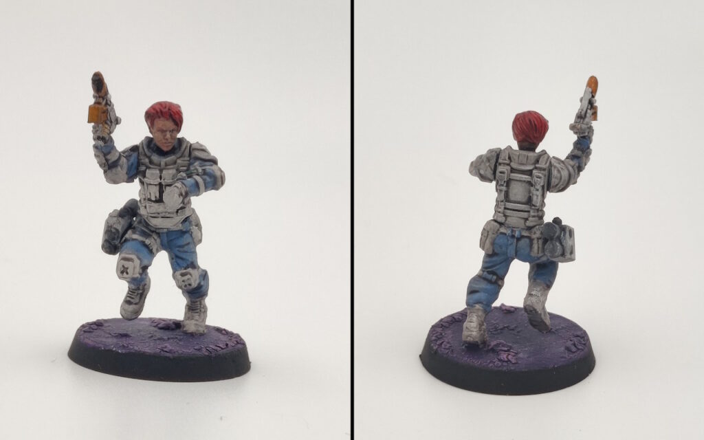
The Space Science Lady is probably my favorite. I painted her mostly using the normal routine: base, shade, drybrush/highlight, etc.. And it wasn’t a pain, but mostly because to the sneaky trick I like to call “Not Caring.”
When you Don’t Care what each part of the kit is, you can achieve a decent three color minimum painting scheme with minimal effort. With GCPS troopers, you can easily imagine that the fatigues and webbing are of the same color and go wild. Maybe paint some of straps black. Of course, you have to first determine what counts as a strap…
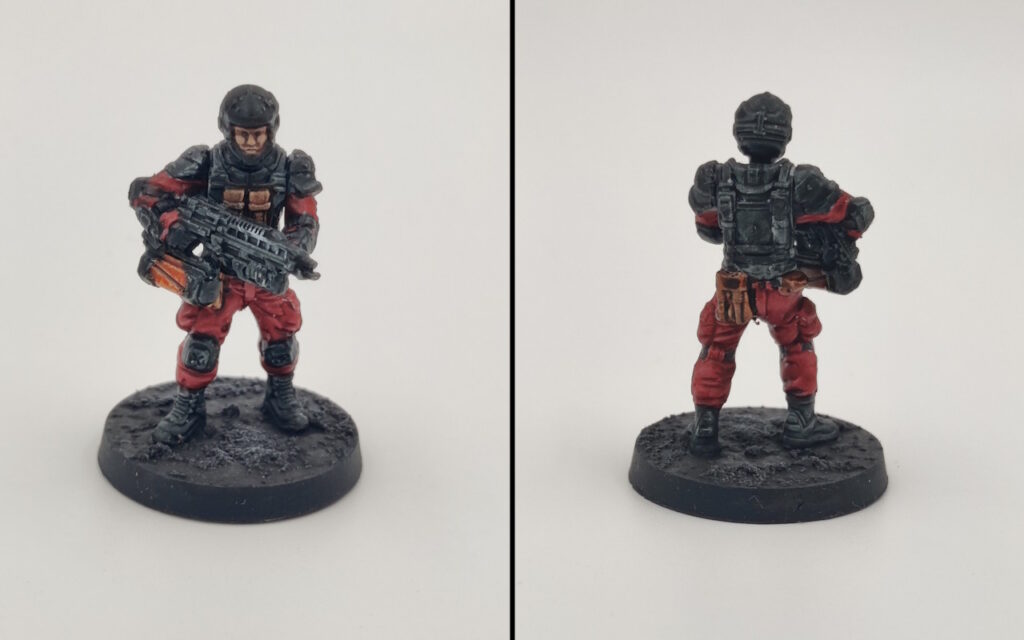
On the other hand, this dude sporting Inquisitorial Stormtrooper/Mazon Labs colors was all Contrasts. And it works. It’s the correct approach. As you see, I picked out more details, what with the brown parts. But painting him was so easy, I don’t even remember doing it.
Remember: Contrasts work best on models that are annoyingly detailed – think Infinity or [any Space Marine character from Wargame Exclusive]. And between the webbing, the fatigues, the guns and greebles, GCPS troopers are very detailed.
The trooper with ballistic glasses, the one not getting a dedicated shot, was painted normally and… no, it was not worth the effort. Contrasts all the way.
See, here’s a Ranger, painted in GCPS colors, all Contrasts. He looks great for the time investment. Painting the rifle in a single color is the way to go. Don’t bother doing anything fancy or picking out details like in store pictures.
And yes, the guns are the elephant in the room when it comes to Imperial Guardsman proxy talk. Not only do they look too advanced, too detailed for Guardsmen, but they’re also too small. GCPS Troopers are more realistically proportioned, so I don’t think they’d mix well with the GW shit.
The special weapons are also inferior in design to GW’s fairly iconic stuff. But that’s not just Mantic’s problem – I’ve painted some Wargame Atlantic Grognards, and while I can forgive the tiny, reasonably-sized chainsword, flamers et all just look like cheap knockoffs.
In conclusion, the biggest downfall of GCPS Troopers is in their store pictures. They’re just bad – if technically competent – paintjobs. It has long been one of my theories – that Mantic models suffer from their store paintjobs – and it has been confirmed. However, I’ve also confirmed that GCPS Marines aren’t exactly fit as Imperial Guard proxies.
But that’s OK: you shouldn’t be playing Warhammer 40,000 anyway. Find another game that could use a bunch of human future soldiers and paint them zippy-fast with Contrasts.
Hey there,
Regarding Heretic Legions, there was a promising kickstarter of The Damned. Wargames Atlantic one day should start selling them…. I HOPE!
https://wargamesatlantic.com/blogs/news/army-of-the-damned
Been looking at that one since they announced it. The vehicle design is meh, but let’s be real, we’re in it for the dudemanz.
Interestingly, I find that most of Mantic’s models look horrible on their website, but once I’ve built them, or I see them in person, I find they are far more attractive. I am not sure what it is they are doing, but their website really doesn’t do their models any favors.